
Colour is important in many aspects of our lives and the colours we surround ourselves with can have an impact on our mood, how we feel and our well being.
The colours that we choose for our homes can make us feel relaxed and comfortable and are also an expression of our creativity, how we view the world and how we want the world to see us.
Many Japanese people, especially young working people, live in small rented apartments where they are not able to make changes to the fittings or the neutral décor. Indeed, they must leave the apartment exactly as it was when they moved in. However, with the use of colourful soft furnishings, homeware and clever accessories they are able to transform their accommodation into an individual space that reflects their own personality and meets all their functional requirements.
In Japanese culture, colour can have great significance and meaning and often has strong connections to nature and the seasons. We can take inspiration from these different meanings when choosing colours for our own homes.
You may feel that strong colours are not for you but when paired with a neutral base they can provide a lively pop to brighten the room. Choosing your favourite colours will make you feel warm and more at home and even using clashing colours gives an informal feel that’s fun and comforting.
Here I explore some of the meaning that particular colours hold in Japanese culture and how you might use them in your own space.
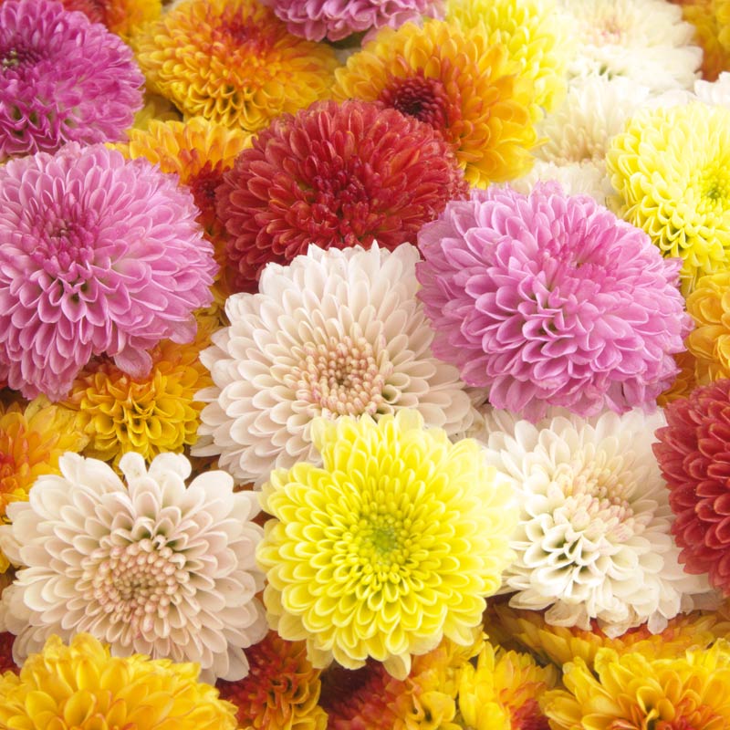
Pink
Pinku ピンク
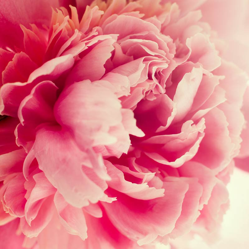
In Japan, pink is not seen as the preserve of young girls and is worn by men and women alike. The colour is associated with spring, youth and good health.
Around the home, pink is versatile too as the different shades, from the palest rose to the deepest magenta, convey very different messages.
Bright pinks like cerise and fuscia are warm and vibrant. They will give you a lift whatever the weather and however you are feeling. The stimulating pop of colour will bring a minimalist interior to life, lifting it out of the ordinary with a mischievous wink.

Pastel pink is soft and surprisingly neutral, blending well with greys, creams and browns. It will look natural and informal, bringing lightness and a carefree air into the room.
Even if pink is not your thing, try adding a splash here and there: a couple of cushions in different shades and patterns or colourful ceramics to set your table. Paired with neutrals, white and other pale shades they will look amazing or bright tones with other jewel colours and black will give an opulent feel.


Blue
Aoi 青い
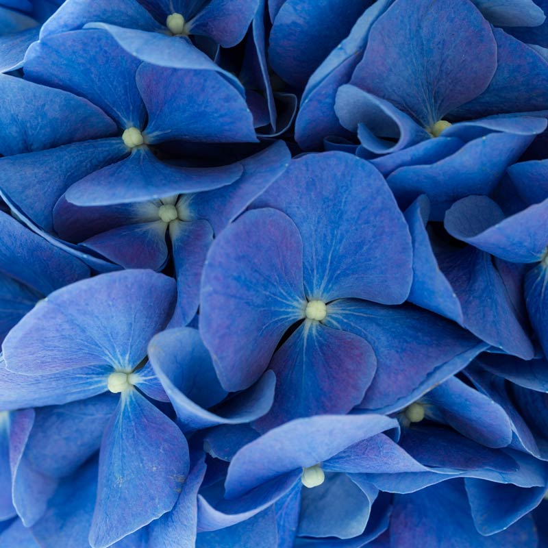
In Japan the colour blue is associated with cool calm and purity but it also means business as many office workers and professionals will opt for navy or other shades of blue when selecting work wear. It’s also a lucky colour so maybe that’s why fresh graduates will choose to wear blue for interviews.
In this way, it can seem conservative but playing with different shades and pairings you can take it from smart urban to cosy and traditional.
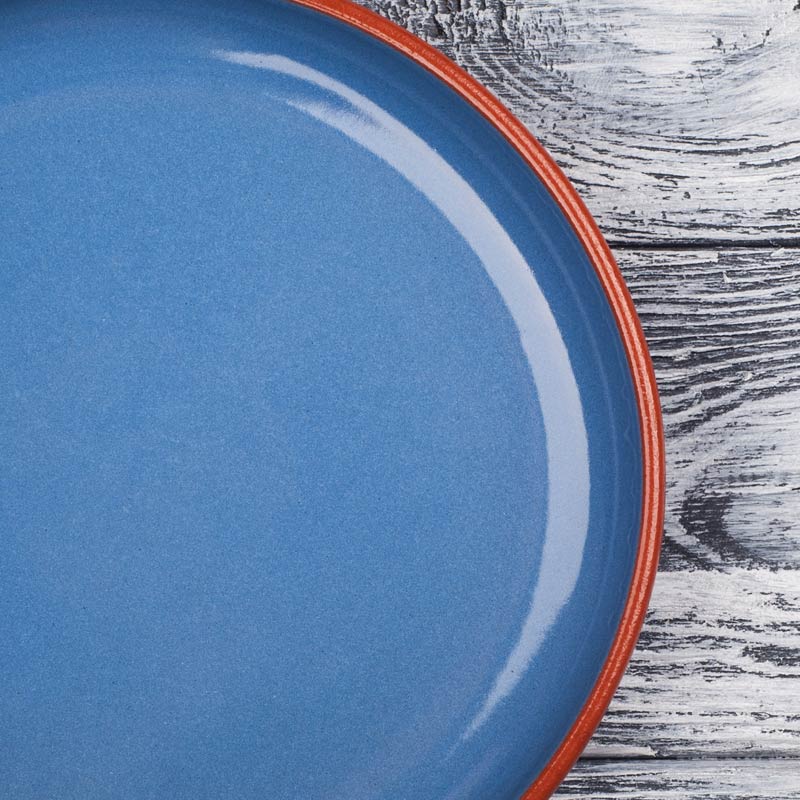
Blues from dark navy to pale sky pair beautifully with white and look crisp, clean and fresh. But you can soften the look by matching dusky shades with cream, off white and grey. A splash of red adds a little fun and a spirit-boosting lift.
Vibrant mid blues have a modern feel and go well with natural wood, gold and silver.


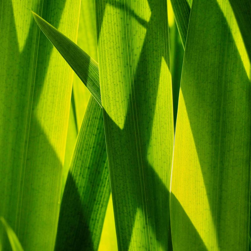
Green
Midori 緑
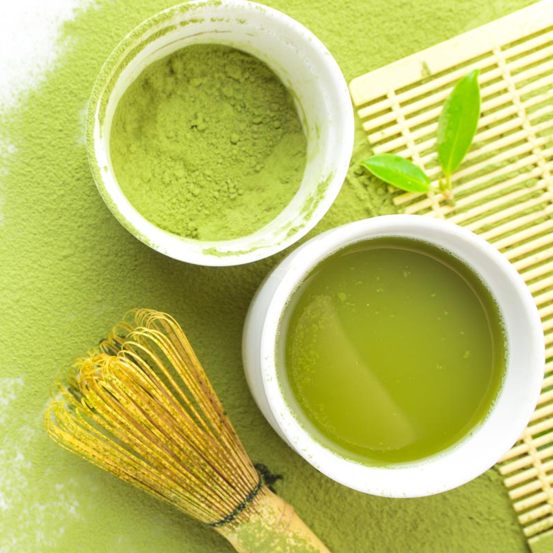
Green is an important colour in Japanese culture symbolising youth and energy. It is the colour of nature’s foliage and, of special significance to Japanese people, green tea and matcha.
People in Japan love to be reminded of nature and the seasons even (or maybe especially) when they live in the city. Most Japanese homes try to make space for a garden even if it’s just a tiny courtyard and even in apartments, having greenery in the form of house plants or cut flowers and foliage are important aspects of the décor.
In the home, green and white make a refreshing combination. Pale pastel and vibrant citrus hues equally look zesty and energising when paired with pinks and light blues.
Soothing dark greens blend well with blues, golds and moody greys building a natural, cosy warmth that’s ideal for relaxing in.
If ever there was an easy way to bring the garden indoors, it's by adding green!


Red
Aka 赤
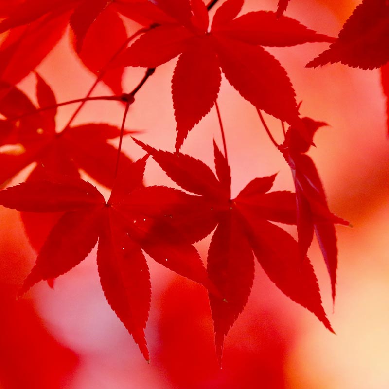
Red in Japan is associated with strength, joy and happiness and is also considered to protect against disaster and bad luck. Of course it features prominently on the Japanese flag and is the colour of the sun (not yellow as western people might say).
It’s the colour of occasion and celebration and is often seen at shrines and temples.
As far as interiors go, most people would probably use red sparingly in their décor although deep rich shades would certainly create an intimate atmosphere with warmth and bold passion.

If that’s too heavy for you however, red highlights which can go from dark burgundy to washed out almost pink tones can really lift a neutral colour scheme and be a quick way to add personality and brightness to a room where you’re not easily able to decorate walls and flooring.
Red is stimulating and energising so could be great in the kitchen or how about a splash in your work space?


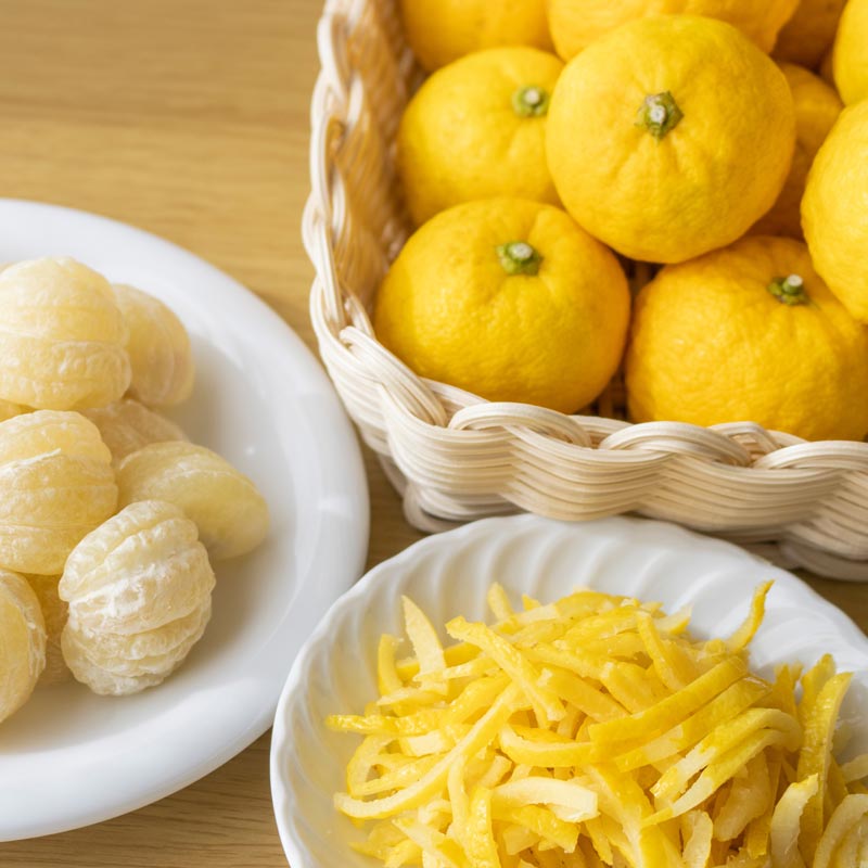
Yellow
Kiiro 黄色
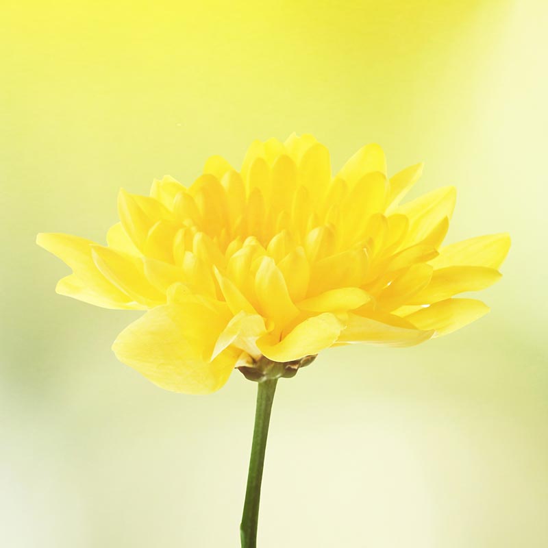
In Japan, yellow is a colour that represent warm sunshine and brings to mind the beauty of nature. I think we can all get on board with that!
Yellow is bright and cheerful, the colour of wild flowers and spring meadows. For a long time yellow didn’t seem like a fashionable colour in western home décor however, I’m glad to see that it’s being used much more readily nowadays.
Pale primrose yellow has a country cottage feel to it and a gentle nostalgic air. Go a little brighter and you’ll definitely lend a mid-century vibe, especially when used with mid blues and browns.
Pastel yellows and greens look lovely when combined in floral patterns and paired with soft whites and palest blue will bring the carefree lightness of spring throughout the home.
Yellow with pink can be difficult to get right but with careful choices will look chic and modern and maybe just a little avant guarde.


I hope you have enjoyed this quick skim through some of the basic colours, what they can symbolise and how they make us feel.
The colours we choose to have in our homes should not be dictated by trends and influential designers but should reflect our own personalities and, most importantly of all, be a source of pleasure, comfort and happiness.
More colourful homeware & accessories
